We are super excited about Membrain's new Products feature which was recently launched with great anticipation. "Products" offers a solid database where the services, products or offerings you have as a company can be managed and tracked, along with their unique pricing structures.
Furthermore, when we take Products and combine it with Membrain's intuitive Dashboards - the reporting possibilities are no less than spectacular.
Already we've seen some impressive use-case scenarios out there, with all kinds of creative ways to show, segment and sort data, and display them in full-colour charts and graphs. So I thought I'd share with you a Top 5 list of the most powerful dashboard graphs we've seen so far.
Check out these examples on how you can use Products and Dashboards to get detailed and insightful reports on what's making your business thrive.
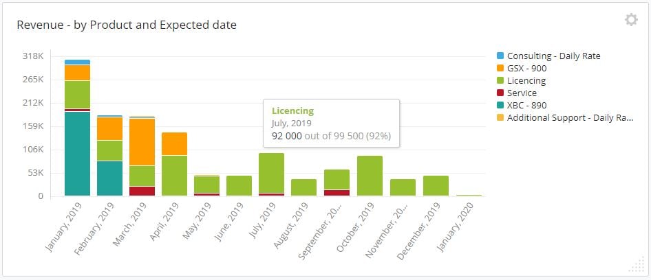
1. Revenue by Product and Expected date
This forecast graph shows us when we can expect to see revenue coming in, and from which Products. Hovering over each section in the graph gives you additional insight into your graphs. Interesting to see Licencing (a recurring cost) is making up most of the revenue in the later months of the year, with almost no new sales forecasted.
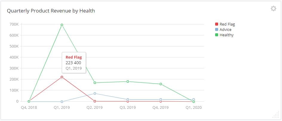
2. Quarterly Product Revenue by Sales Project health
Not all deals will be won, so looking at the health of the pipeline, as well as the expected revenue is a wise move. Here we see quite a large chunk of Q1's expected revenue is showing as unhealthy with red flag warnings. Time to take some action and save these projects before they fall out of the pipeline.
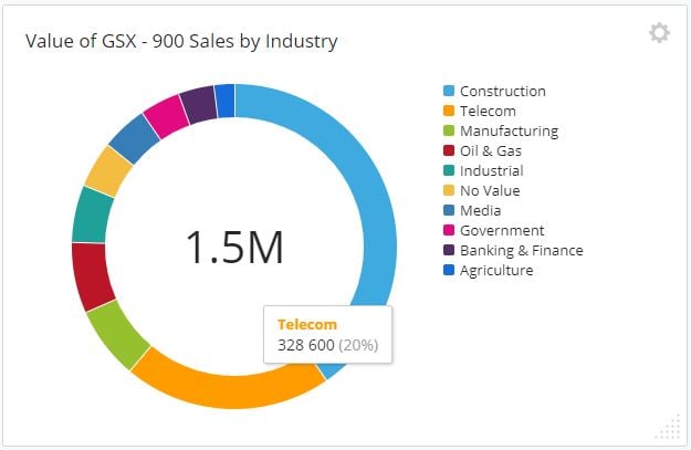
3. Revenue from Products by your own Custom Fields
Want to see some figures based on your own process? No problem. Being able to incorporate your own Custom Fields into these reports is eye-opening. See revenue by Industry, Source, Partner or any other specific datapoint you track in your business. Here we see the Telecoms Industry makes up 20% of all sales for GSX-900s.
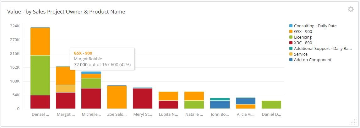
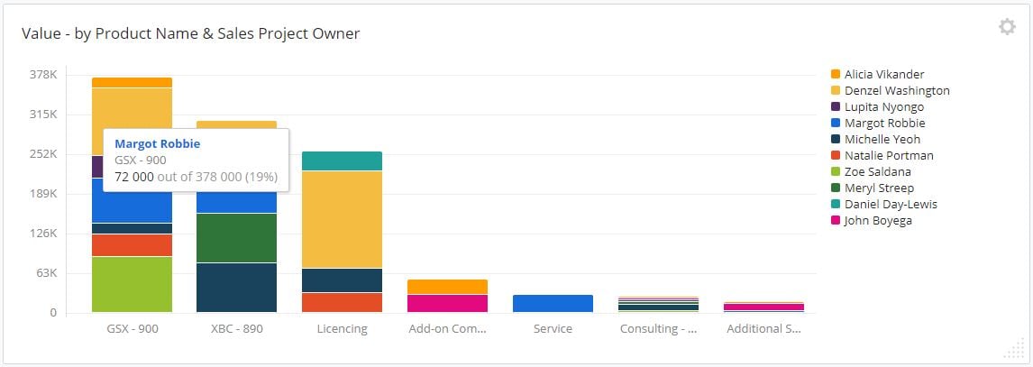
4. Value by Sales Project owner & Product
This graph is a great way to see who in your team is bringing in the most revenue, while at the same time, show which Products are attributing to that total. Here we see Margo Robbie sold 72k worth of GSX-900's, making up 42% of her total sales.
5. Value by Product and Sales Project Owner - This is, in fact, the exact same graph, just flipped on its head to give you a totally different angle to whats in the Pipeline, and who's put it there. Here, we see Product Value by Product Name and segmented by Sales Project Owner. Just two mouse clicks gives you a fresh perspective on the same data set. When we look at Margo Robbie in this graph, we see her 72k of GSX's, and also that this is 19% of the total revenue coming in from GSX sales.
These graphs are just the tip of the iceberg when it comes to what you can do with all the data you have about Sales Projects, Companies and your Team - and now using the new angle Products brings.
Ready to build your own customized Revenue Dashboard? Great! Let us know if you would like a personalised walkthrough of how you can use Products with The Dashboard to improve your reporting and revenue forecasting.
Or take a look at the Products and Dashboard help center articles to get started today!
Help us spread the word about how great Membrain is and write a review on G2Crowd


