sales analytics

Win Rates 101
There is so much conversation about win rates. But in those conversations, there’s a lot of misunderstanding. What we measure, how we measure it, varies tremendously. Some measure win rate from very first contact. Some measure it from the moment of qualification. Some measure it on a $ basis, some on a deal basis. Some measure win rates within live deals, some look at past deals.

Actually, Your Salespeople May Want More KPIs
Tracking Key Performance Indicators (KPIs) can be a salesperson’s worst nightmare. Why should they have to meet arbitrary goals as long as they’re making the sales you hired them to make? This is especially painful when the KPIs don’t seem connected to outcomes.

Are Your Salespeople Selling or “Playing Sales?”
In the world of complex sales, people generally take themselves very seriously. Sure, there’s fun and laughter in the workplace, but when it comes down to it, business professionals like to think of themselves as results-driven, real-world achievers.
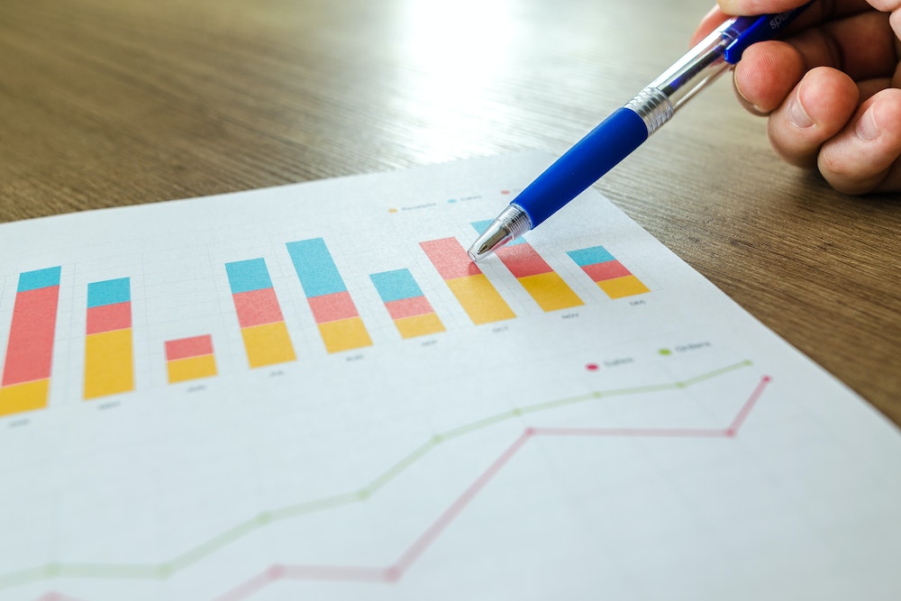
3 Ways Data Visualization Can Improve Sales Analysis
Data visualization is a powerful tool for sales leaders and professionals to improve analysis and decision-making. From prospecting more effectively to understanding your pipeline and seeing where your greatest account opportunities lie, the ability to take bare numbers and make them visual can make the difference between stagnant results and continually improving performance.

How to Execute Your Sales Strategy Effectively Using Win/Loss Analysis (Part 3/3)
Over the past two weeks on this blog, I have laid out a simple framework for using win/loss analysis to massively improve your sales effectiveness, including how to collect the right data and how to supercharge your sales strategy.

How to Supercharge Your Sales Strategy with Effective Win/Loss Analysis (2/3)
Your win/loss analysis can be a secret weapon for improving every aspect of your business. From sales strategy to individual sales skills, this three-part series gives you the framework for improving the way your sales system performs each year, using your win/loss analysis.


