Creating Graphs
Graphs can be created by pulling in data from lots of areas in Membrain. This gives you the opportunity to create stunning visual graphs that cover a range of different data points from various angles of Membrain. You can configure and interactively create, modify graphs., and change the type of graph at any time. You can build your graph, pulling data from the following data types:
- Prospects
- Sales Projects
- Account Growth Projects
- Tickets
- Companies
- Contacts
- Activities
- Documents
- Product Revenue
- Performance
- Users
- Form Submissions
- (Other) iFrames (Integrate external data sources and web content directly into your dashboards)
- (Other) Rich Text (Enhance your content with formatting options like bold, italic, and underlined text)
- (Other) Section (organize your dashboards by creating distinct headers and sections)
Getting Started
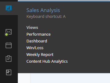
- You find Membrains Dashboard from the Main Membrain Menu, under Sales Analytics. Click on the Sales Analysis icon and select Dashboard
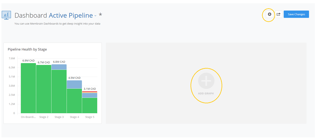
- Within the Dashboard, you can click on "Add Graph" to create a custom report or select from a gallery of pre-defined and pre-formatted graphs.
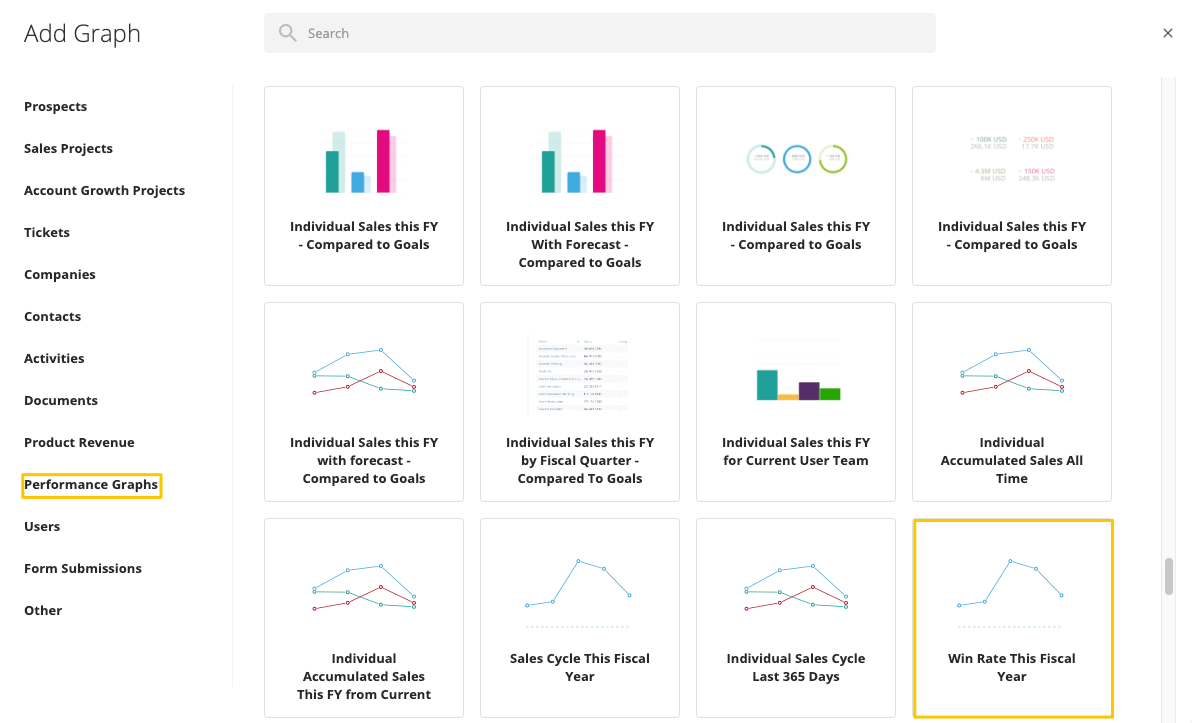
Selecting a Graph from the Gallery
- When you click on "Add Graph", you have the option to create a new custom report or select a report from the gallery of graphs.
- Decide on the category you want to create the graph. Within each category, you will find key pre-built recommended graphs, plus a custom option to create a graph from scratch.
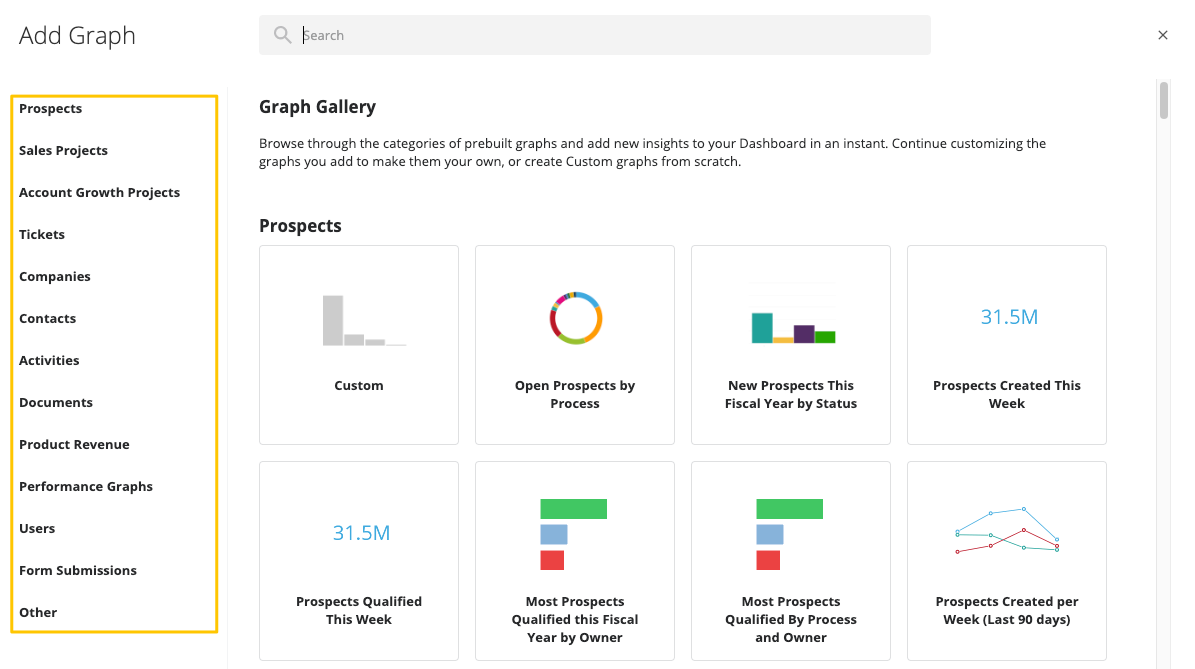
- Once you select the pre-built graph from the gallery, you have the flexibility to configure and rebuild the graph to fit your needs.
- To keep the data points as they are pre-defined, simply click Save and the graph will be added to your dashboard.
Example - Performance Graph
- Select Performance Graphs.
- Select the "Win Rate This Fiscal Year" prebuilt graph.
- Configure the graph.
Note: The Performance graph provides extra filtering options: “All (individually)” and “Team (individually)” when choosing “Who” in a performance graph.
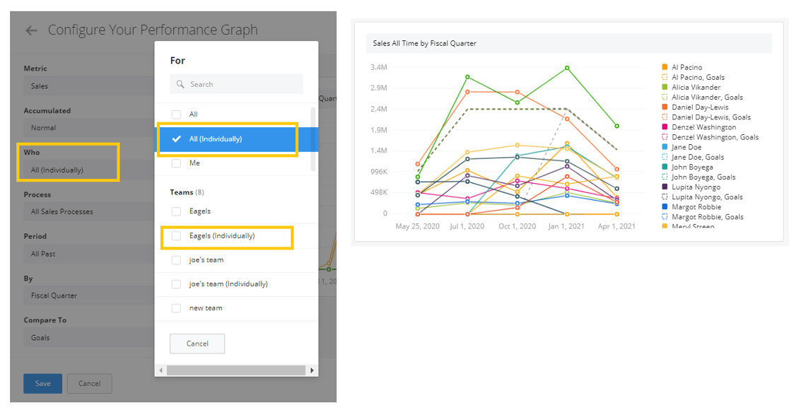
- Click Save.
Creating a Custom Graph
- To create a custom graph, select "Custom" under the category (from the left) you want to start building from.
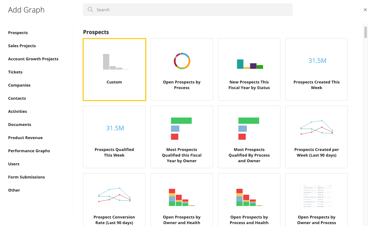
- The configuration page will start you off with a blank configuration for you to start building your graph.
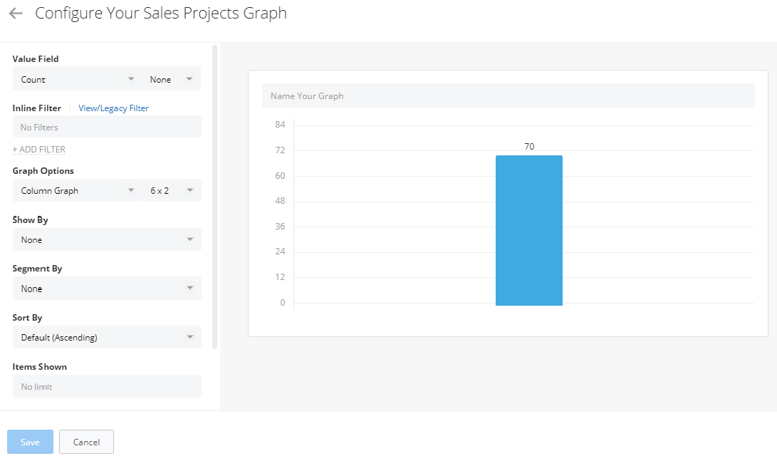
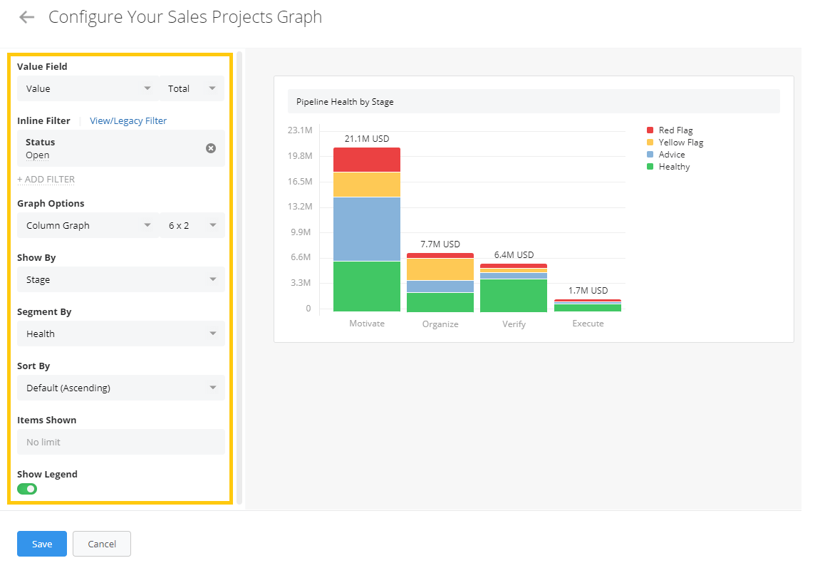
Graph Configuration
Value Field - Select what you want to measure the data in your graph on, for example, value, count, days since last activity, time in stage, or any other custom fields you are using.
Note: Depending on which graph category you have chosen, it will list custom fields relevant to that in the dropdown menu.
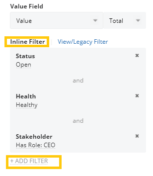
Filter - There are 2 options available for filtering your data - Inline or Saved. Filtering allows you to select a specific subset of data that you would like to see in the graph, based on certain criteria. For example - just sales projects from a certain process, or within a certain time frame.
- Inline Filter - The inline filter is not saved in the filter database of Membrain, but saved to a particular Graph. The Inline filter is added directly in the setup dialog which brings a lot of flexibility to the creation of Graphs. All you have to do is add the layers of filters you want to apply and save the Graph.
- Select Inline Filter
- Click +ADD FILTER
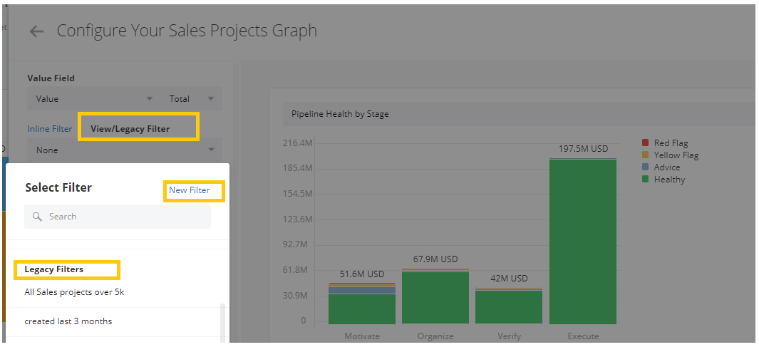
- View/Legacy Filter - If a filter is saved it can be reused in other Graphs and of course throughout other parts of Membrain as well. To use a saved filter in your graph, click into the View/Legacy Filter tab and select from the dropdown. Or, create a new filter. To learn more about creating filters, read this article Working with Filters.
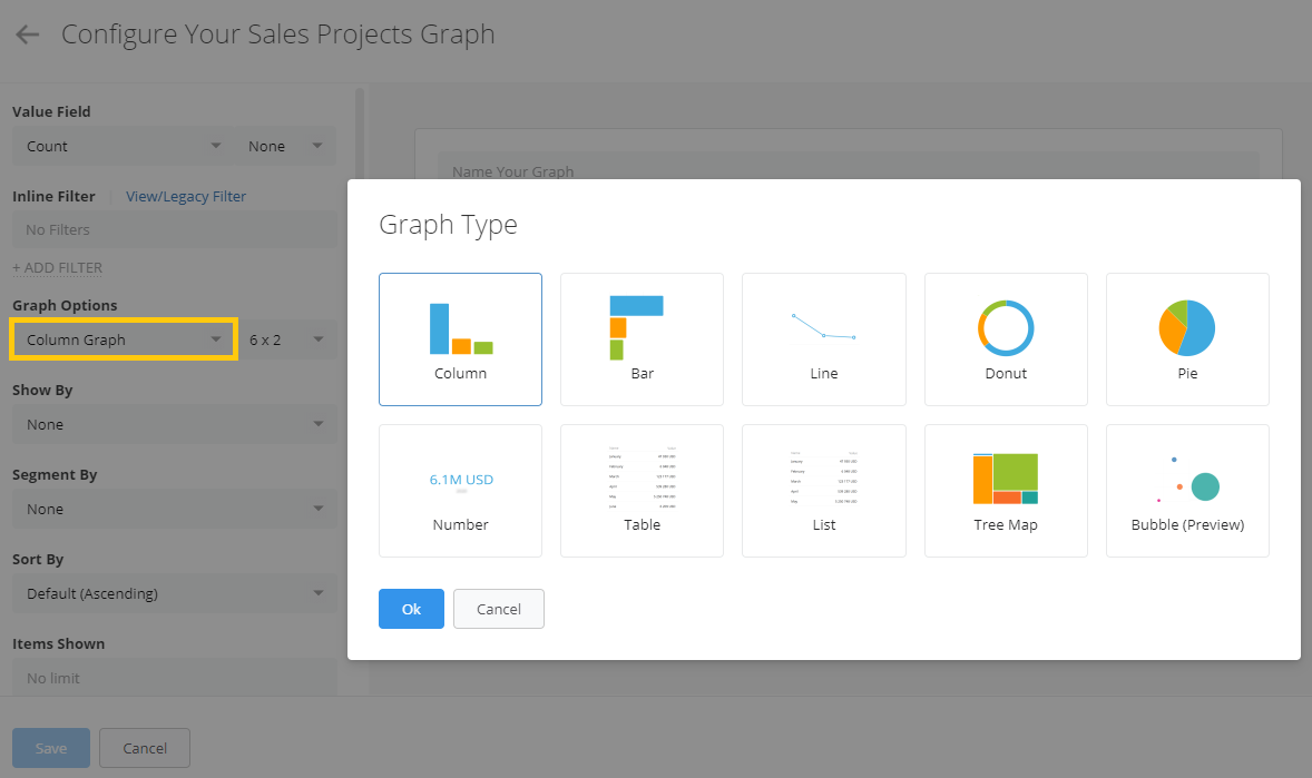
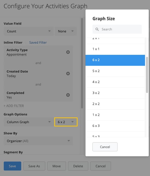
- Graph Options - Select the type of your graph from options such as Column, Bar, Line, Donut, Pie, Number, Table, List, Tree Map or Bubble.
- Graph Size - You can also choose the size of your graph, which is then easily resizable from the Dashboard. This allows you to arrange the Dashboard with Graphs in various different sizes and shapes.
- Graph Details - Once a graph has been created, you can find details about the graph by hovering to the right of a graph's name where an 'i' will appear revealing the graph's details.

Working with Graphs
Membrain’s graph tools allow you to customize your visualizations to your liking. Here’s how you can modify graphs within your dashboard:
- Edit Graphs – Click on the cogwheel icon in the top-right corner of your graph to access editing options.
- Resize Elements – Adjust the size of graphs and columns to improve readability, using the drag and drop in the bottom-right corner of the graph, or hover over the blue column marker and drag left-right to adjust the column width.
- Move Graphs – Hover over the top border of the graph, once you see the move cursor
 , drag your graph to the desired location.
- Copy Graphs – Duplicate an existing graph, along with its configuration. This is particularly useful and a huge time-saver when you need a similar graph with slight modifications, and don't want to start from scratch.
- Delete Graphs – Remove any unnecessary graphs with a simple action.
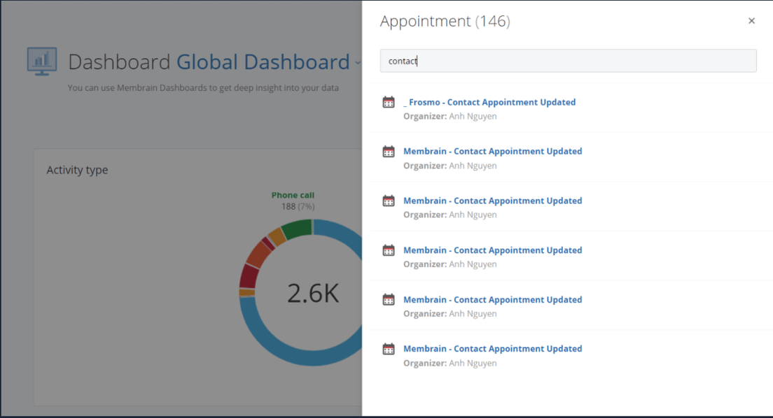
- Search in Graphs - When you click on column, bar, donut, pie and list graphs you get a list of the included objects. You can drill down further within the return data set by searching by keywords. This feature is not supported in performance graphs.
Organize your Dashboard
Membrain's dashboard tools help ensure that dashboards remain clear, organized, and tailored to your specific needs.
Create Sections
Using Sections gives more structure and allows you to add descriptions and additional details to sections within a Dashboard.
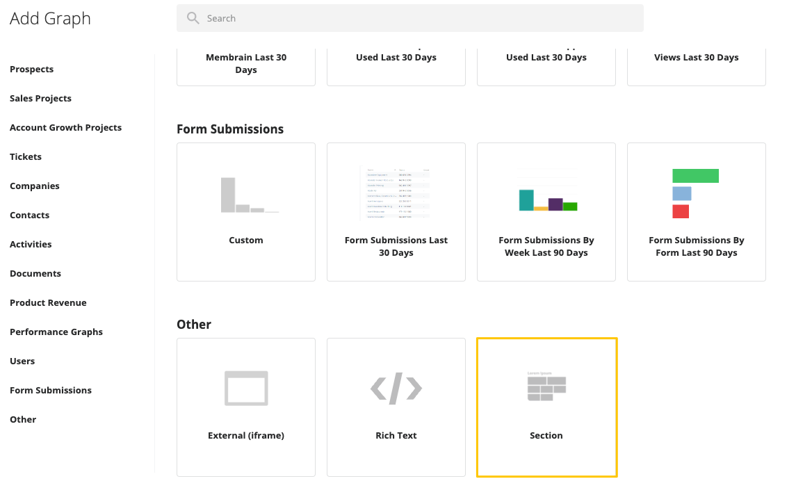
- Click on the +Add Graph button and select Other - Section
- Give the Section a Headline and optionally add a Description (you'll see a preview of your Section, to the right)
- Click Save.
- Drag and drop the Section to where you want it in your Dashboard.
Add New Graphs
Membrain also provides you the flexibility to create new graphs anywhere within your Dashboard.
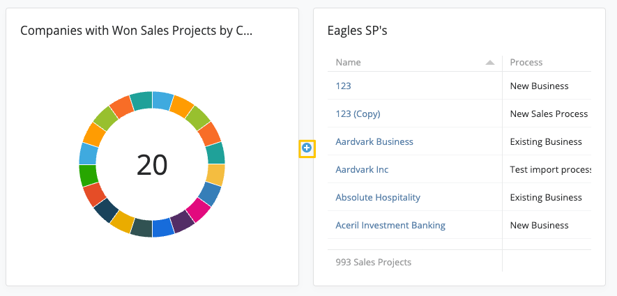
- When you hover over the space between two graphs, a small
 button will appear. This button allows you to insert a graph exactly where you want it.
Rearrange graphs and sections
Once you've built up a couple of graphs and added sections, you might want to rearrange them in the dashboard in the order of your liking.
- Move a Graph - To reposition a graph within your dashboard, you have two options:
- Hover and Drag - Hover over the top border of the graph. Once you see the move cursor , drag the graph to the desired location. As you move the graph, the background will indicate the new position, turning gray. Release the graph when you've identified a suitable spot, and it will smoothly settle into place.
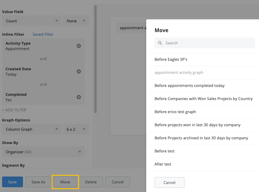
- Use the "Move" Button - Click on the cog wheel icon in the top right corner of the graph you want to move. This will open a menu, click on the "Move" button in the bottom left corner. You'll then be prompted to select where you'd like to move the graph. This could be before or after another graph in your dashboard.
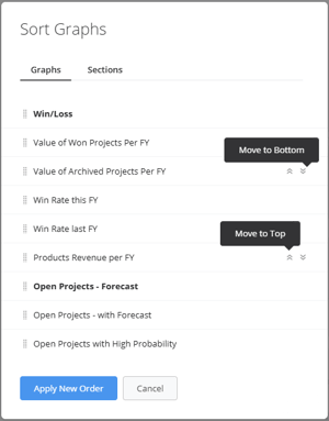
- Reorder graphs/sections - From the top-right of your dashboard's page, click on the
 icon and click on the "Sort graphs" button.
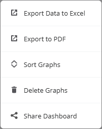
Share your Dashboard
To share a dashboard, navigate to the top-right of your dashboard's page and click on the icon.
From there you have 3 options:
- Export Data to Excel - This option, generates an excel spreadsheet that can be shared and/or analyzed further outside the platform.
- Export to PDF - Export your Dashboard in pdf file for use in meetings or to share with external people.
- Share Dashboard - Generate a link and share it with any user in your Membrain instance, that will bring them to the Dashboard. Note: The User whom you're sharing the link with will only be able to use it if they have sufficient permissions to access the Dashboard.