Popular Content
Membrain for:
Product Revenue graphs help you analyze revenue at the product level and understand where that revenue is coming from across your sales activities.
With the new Product Revenue graphs in Dashboards, you have greater flexibility to determine which Product Rows should be included in your analysis and use a wide range of filters to narrow the data to your liking.
Product Revenue graphs report on Product Rows. Depending on how your organization works with products in Membrain, those Product Rows can be coming from different sources:
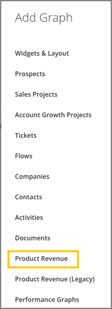
The new Product Revenue graphs are currently available in Dashboards. When adding a graph to a Dashboard, select the Product Revenue graph option. This is the preferred option because it provides more robust and flexible filtering capabilities, compared to the Product Revenue (Legacy) one, including access to Product Rows from Sales Project Products and Quotes and Orders across Companies, Sales Projects, Account Growth Projects.
The legacy version remains available during the transition for existing graphs and for scenarios the new Product Revenue graph cannot yet replicate.
The most important part of configuring a Product Revenue graph is determining which Product Rows should be included.
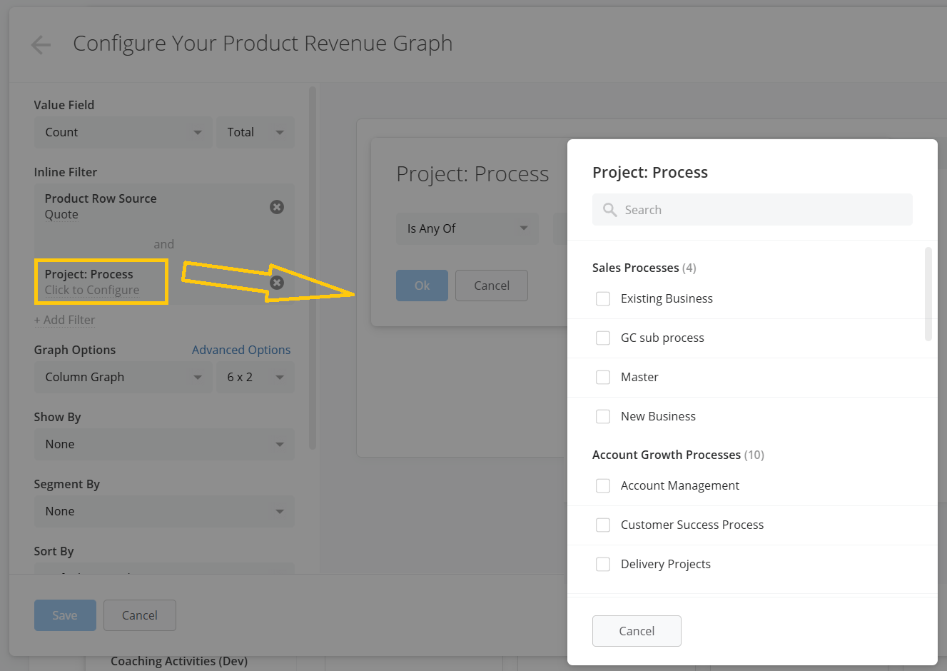
Click on the +Add Filter button, Product Row Source and choose where the Product Rows should be coming from, i.e. Sales Projects Products, Quotes and/or Orders.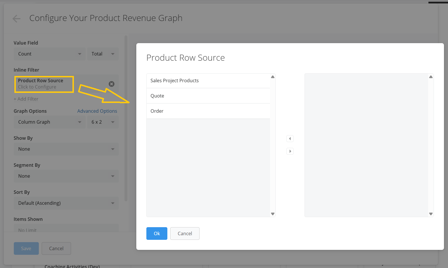
Product row properties: Product, Description, Revenue, Revenue Date, Quantity (Total), Unit Quantity, Price (Total), Unit Price, Cost (Total), Unit Cost, Profit (Total), Unit Profit, Profit Margin, Discount (Total), Unit Discount, Discount Rate, Price Type.
Document Properties: Document Type, Document Category, Quote/Order Date, Created By, Created Date, Changed By, Changed Date, and any other Document Custom fields you might have created.
Project Properties: Name, Status, Won/Archived Reason, Process, Health, Value, Weighted Value, Probability, Age, Starting Date, Closing Date, Owner, and many more Project-related Base and Custom fields.
For example, you could configure a graph to focus on Product Rows from Quotes associated with a particular sales process, or analyze Product Rows originating from Orders that are synced into account growth projects through your ERP integration.
This makes the graph useful for both pipeline-oriented analysis and analysis of revenue over time from orders.
Don't know where to start from? We've got you covered!
Membrain offers a list of pre-built product revenue graph templates that you can use as a starting point and tailor as you go to match exactly your reporting needs.
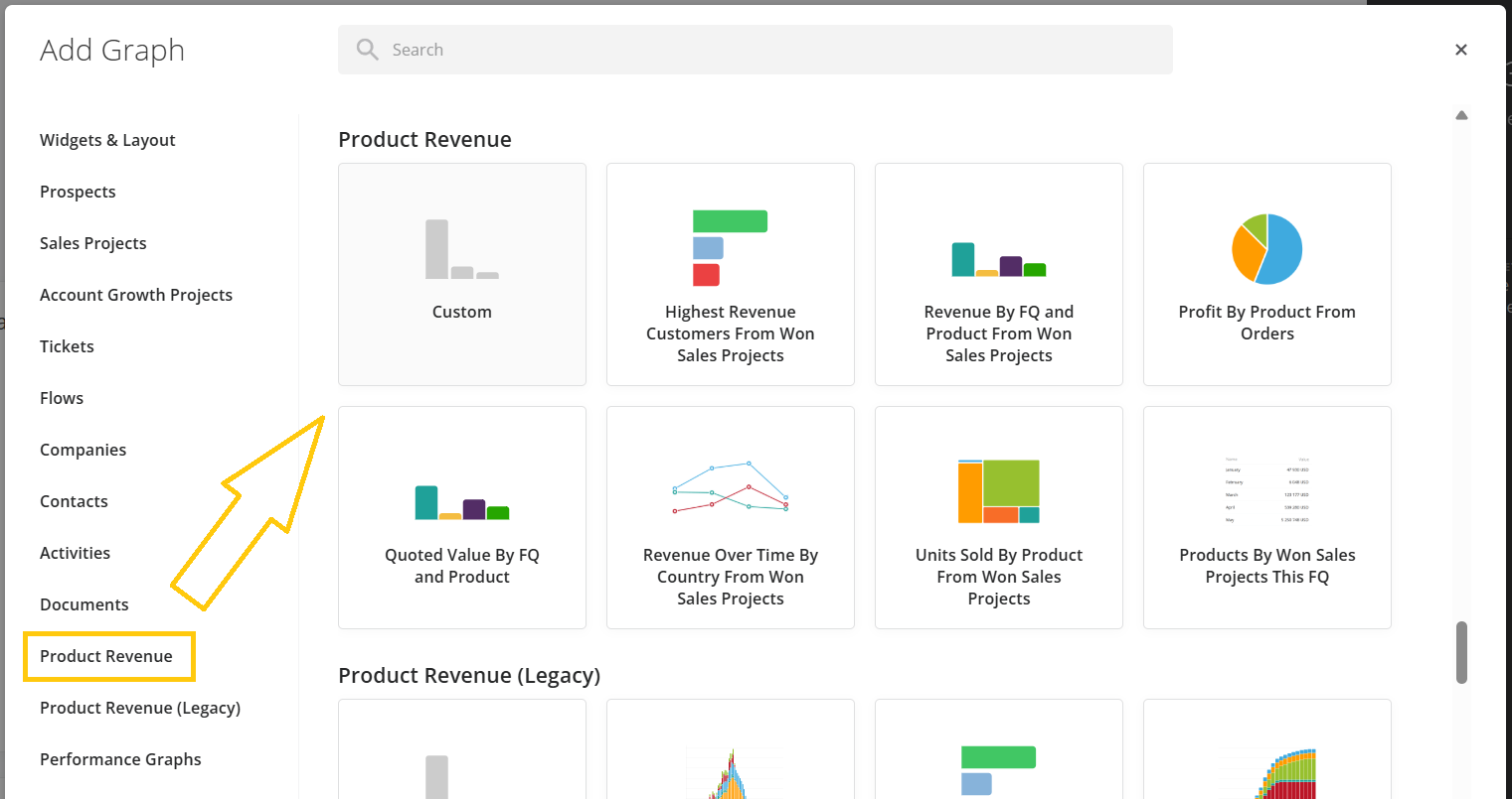
To find these, go to the Dashboard, press the + Add Graph button on the top-right of the page, click on Product Revenue Graphs, and the templates will show up at the top of the dialog.
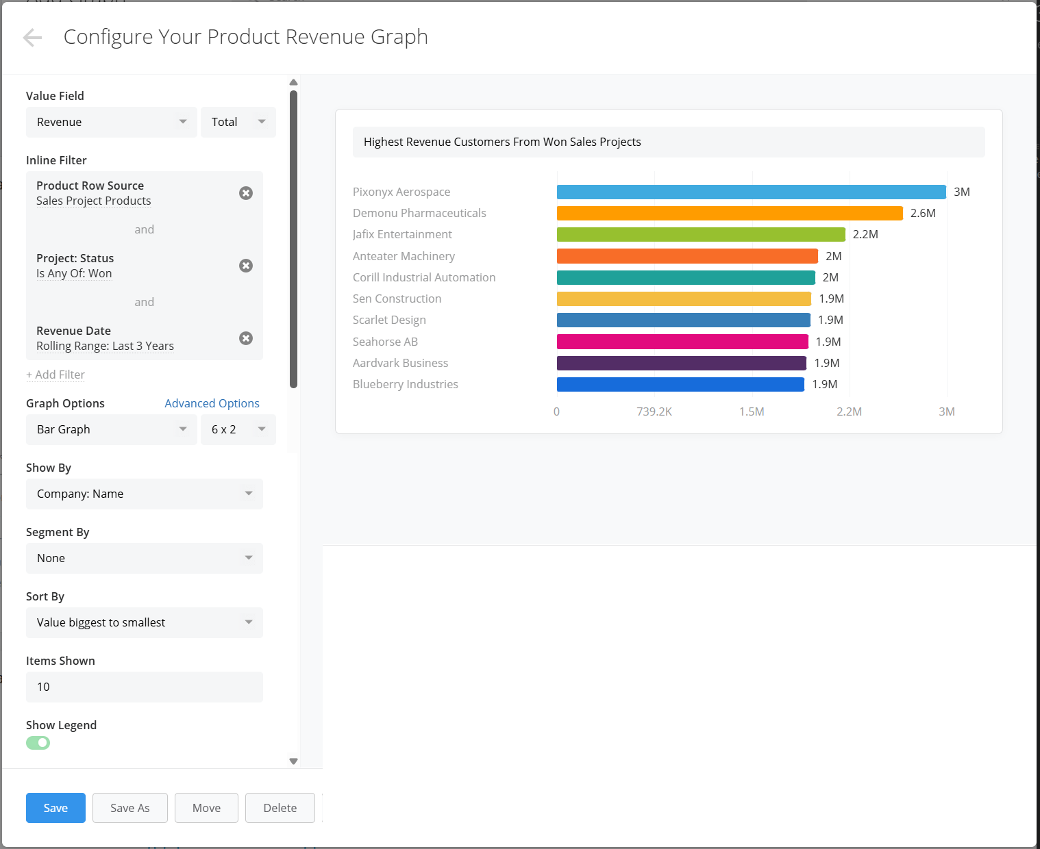
The following graph shows you the top 10 product revenue made from products coming from sales projects won in the last 3 years.
Filters explained:
Value field: This controls what value from the product rows will be shown, and you can choose from a range of product properties such as count, revenue, quantity, profit, price, cost, discount. In this example we have selected "Revenue".
Product Row Source filter: This filter decides where the product rows shown in the graph should come from. Here we have selected "Sales Projects Products"— these are the products added by your Sales Team inside your sales projects.
Project Status filter: This filter is used to narrow down which status the sales projects that the product rows are pulled from, should have. Here we have chosen to only include from "Won" sales projects.
Revenue Date: This filter is used to decide in which time period the product revenue should have occurred. Here we have chosen to show product revenue occurred in the last 3 years (as a rolling range).
Graph Options: The Graph type selected here is "Bar", you might as well select another type such as Column, Number, Donut, Pie, etc.
Show By: Here we select how we want the data to be displayed, for instance by Company: Name.
Segment By: We have the possibility to add a segmentation criteria, but here we've chosen to keep it as None.
Sort By: We can sort the data displayed in the graph in different ways, here we have decided it should be the Value from Biggest to Smallest.
Items Shown: This options lets you limit the amount of data shown in the graph, here we have put 10 items.
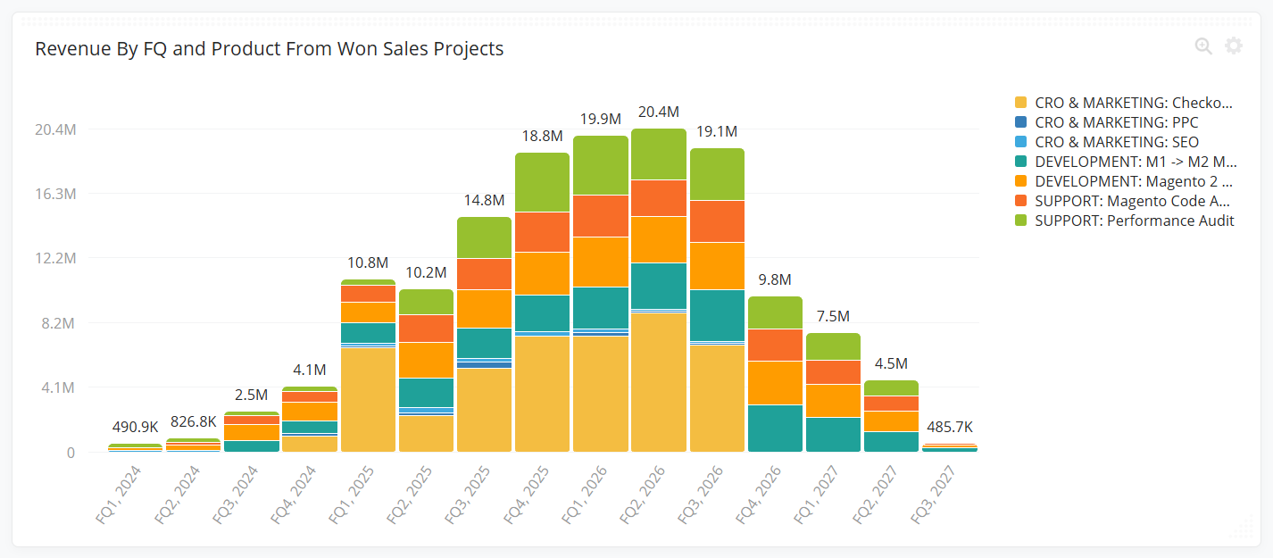
The following graph shows the product revenue made from products coming from sales projects won in the last 3 years. The revenue is broken down by fiscal quarter and then segmented by product.
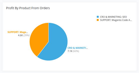
The following graph shows the profit made from products coming from orders in the last 3 years (as a rolling range). The profit is broken down by product.
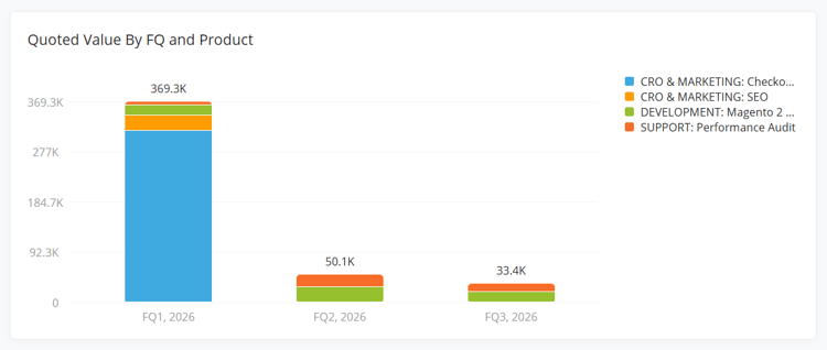
The following graph shows the value of quoted products in the last 3 years (as a rollling range) broken down by fiscal quarter and then segmented by product.